Anyone can learn to code
Multi-resolution blog template
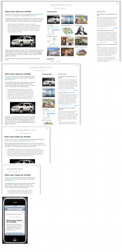
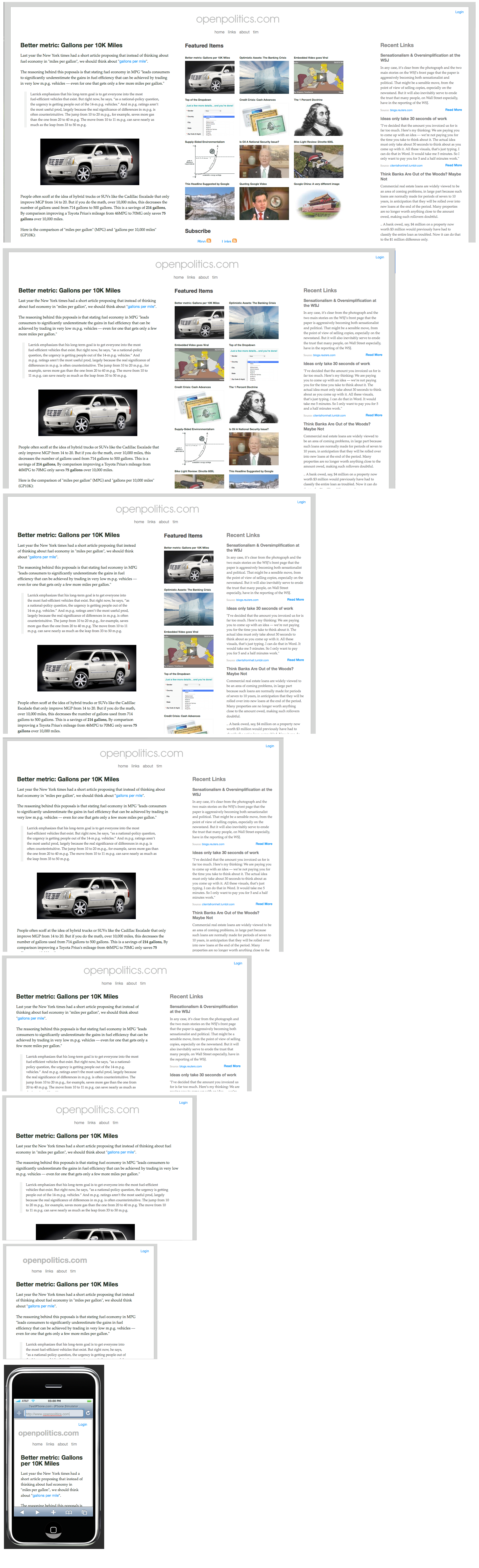
In late 2006, A List Apart had an article about “Adaptive Layout“,
which they described as an improvement over liquid CSS layouts because it is optimized for multiple screen resolutions and adjusts automatically.I was intrigued, so I decided to experiment with an adaptive blog template that automatically adjusts itself to different screen resolutions, from an iPhone to a 1920×1200 monitor.
The result isn’t very “polished”, but I finally got around to posting my own “adaptive blog layout”, which uses javascript to tell the browser to use a different body css class, depending upon the reader’s screen resolution.
Future Improvements
The template could be improved by paying better attention to the most common browser resolutions and developing grid-based versions tailored to specific resolutions. I did the opposite — I started with the content and defined CSS rules to fit my text and images.
Related
License: Creative Commons
